You Can’t Play With My Logo
If the world has taught me anything, it’s that there are two things that you will find common in every New Orleanian you meet:
- They love a fleur de lis and
- They love the Saints.
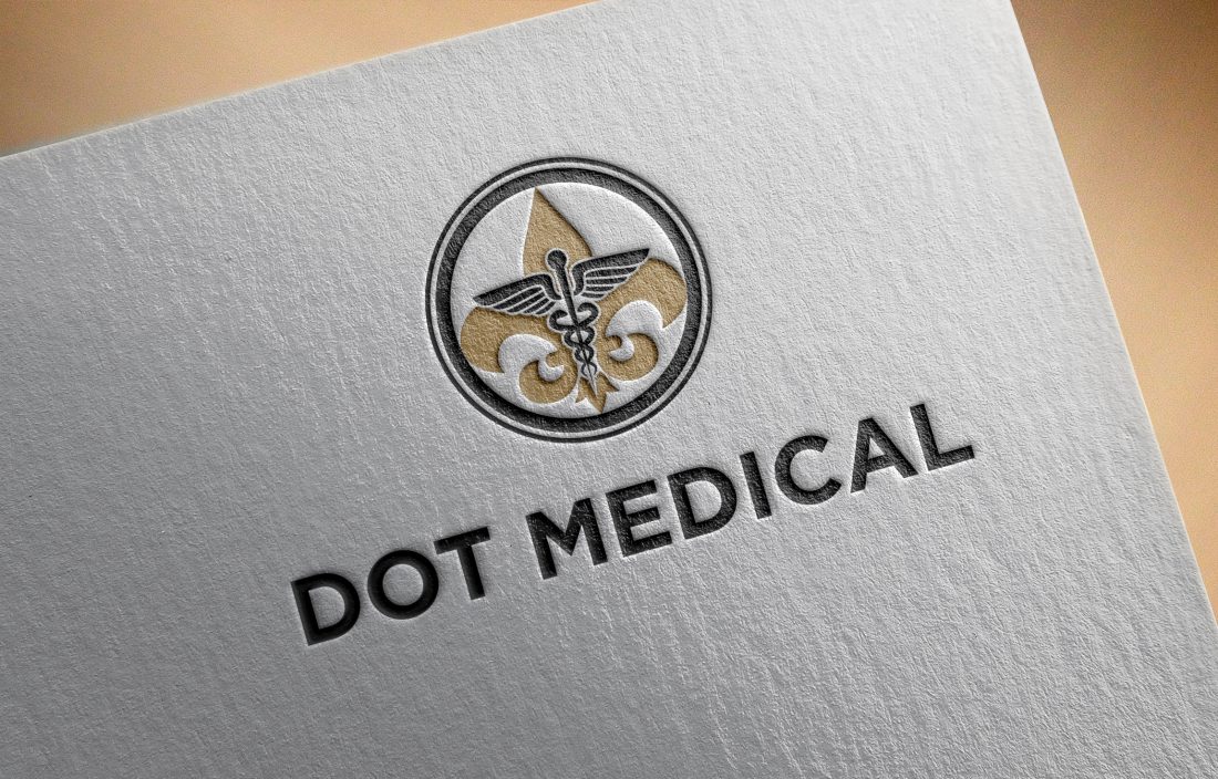
So when the owners of DOT Medical Associates approached Webb Smith + Co. about creating a logo for their medical startup, it came as no surprise they wanted a black and gold, fleur de lis graphic to be a part of their brand.
We settled on a fleur de lis-meets-caduceus icon set in a “dot” (a great visual play on the “DOT” part of the company name…which stands for Department of Transportation).
The process of working with this logo got me thinking about logos in general. There are so many iconic brands that have had to adapt to our changing technology.
In several instances, I’ve come across companies that don’t have a logo that’s adaptable with the changing times. More specifically, they don’t fit on websites or social media profile pictures properly. It’s truly annoying. Considering how much time people spend on the Internet throughout the day, digital is the new black.
So how can you avoid the logo trap house?
- Create a horizontal logo: Vertical logos are great, but when space is limited, having a horizontal version ensures your brand fits perfectly…without the extra white space. You’ve seen examples of logos that are too tall for a website header. You have to scroll down… and down….and down some mo’…just to get to the content. In the words of Kimberly “Sweet Brown” Wilkins, “Ain’t nobody got time for that!“
- Show up in social: Social media profile pictures are square or circular in nature, so having a logo or icon that can fit neatly inside ensures your brand is visible across social media channels. If the whole logo doesn’t fit, use an icon only.
- Reading is fundamental: I’m all for a pretty font, but
sometimesat all times it’s important to be able to READ your company name in your logo. Make sure the font is legible so people can clearly see YOU are posting. - Branch out: Those of you that have been in business since 19-Adam-and-Eve, may have strict rules about changing your logo. What’s an outdated logo to do? Branch out. Talk with the powers that be about using the same font and same icon in different layouts. This can be an easy way to get the flexibility you need without truly “changing your logo.”


Sorry, the comment form is closed at this time.